Today I had to create a slider control for an application I’m working on. I thought I would document how I did it as a reference for others who are trying to get started with widgets. I assume that you have read the Extending LiveCode guide in the LiveCode 8 dictionary.
Declaring a widget
At the top of my slider.lcb source file I declared my widget. Since I’m making this available to the community I used the prefix community.livecode.<developerid>.slider.
widget community.livecode.trevordevore.slider
   use com.livecode.widget
   use com.livecode.canvas

end widget
Since I’m creating a widget I want to import the widget handlers I will need. Search for “com.livecode.widget” in the API dictionary for a list of what these are.
Since I am drawing to the screen, I also need the canvas library so I will use that as well.
Defining meta information
Next I added the metadata which tells LiveCode about my widget.
widget community.livecode.trevordevore.slider
   use com.livecode.widget
   use com.livecode.canvas

   metadata title is "Slider"
   metadata author is "Trevor DeVore"
   metadata version is "1.0.0"
end widget
Drawing the widget to the screen
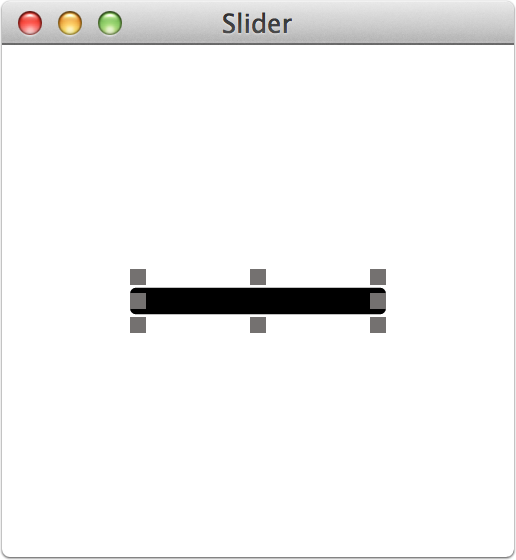
I started by writing the basic logic for drawing the slider components to the screen. I ended up refactoring this code before I was finished, but jumping in and writing the OnPaint() handler at the beginning helped me visualize my control.
widget community.livecode.trevordevore.slider
use com.livecode.widget
use com.livecode.canvas
metadata title is "Slider"
metadata author is "Trevor DeVore"
metadata version is "1.0.0"
public handler OnPaint()
-- Draw the bar
variable tSliderHeight as Number
variable tSliderBounds as Rectangle
variable tCenter as Point
put point [my width/2, my height/2] into tCenter
put my height * 0.416 into tSliderHeight
put rectangle [0, the y of tCenter - tSliderHeight/2, my width, the y of tCenter + tSliderHeight/2] into tSliderBounds
fill rounded rectangle path of tSliderBounds with radius 3 on this canvas
-- Draw the knob
end handler
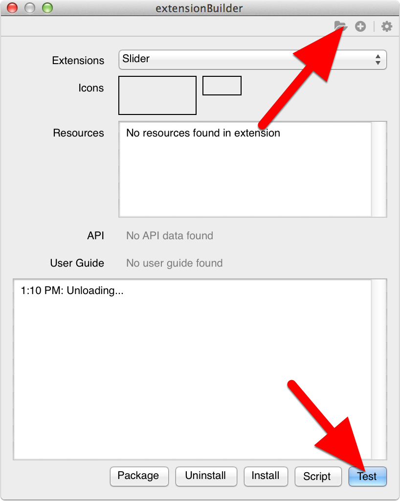
end widgetLet’s test it out and see what we get when I load the extension into the extensionBuilder plugin and click Test. Note that you can load a source file by clicking on the Folder icon in the top-right corner.
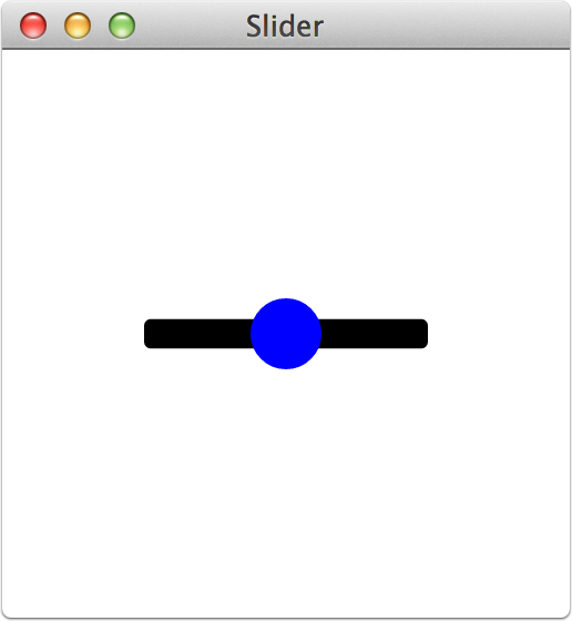
Adda a knob
Now that the bar is being drawn I’m going to add a knob. I added this code to the OnPaint() handler.
-- Draw the knob
set the paint of this canvas to solid paint with color [0,0,1]
fill circle path centered at point [my width/2, my height/2] with radius my height/2 on this canvas
And this is what the widget looks like:
Add a border
I want a 1 pixel border around the knob so I added the following code. Note that when you use stroke the stroke expands out from the center of where you draw. That is why I adjust the path of the stroke by 0.5. Otherwise the stroke would go outside the widget bounds.
-- Draw the knob
set the paint of this canvas to solid paint with color [0,0,1]
fill circle path centered at point [the x of tCenter, the y of tCenter] with radius my height/2-0.5 on this canvas

set the paint of this canvas to solid paint with color [1,1,0]
stroke circle path centered at point [the x of tCenter, the y of tCenter] with radius my height/2-0.5 on this canvas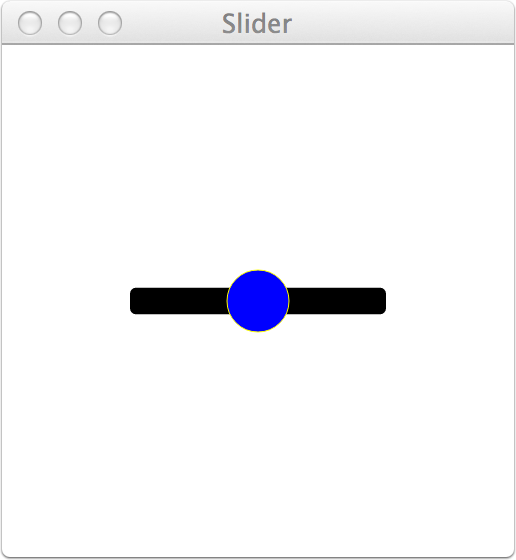
Adding variables
Now that we are rendering something useful, let’s incorporate some variables so that we can allow a developer to change the colors and other properties later on. To do that I am going to declare some variables after the metadata section. After declaring them, I’m going to initialize them in the OnCreate() handler. This handler is called before your widget is displayed and before any data that was stored with an instance of the widget is loaded. It is a good place to set some default values.
Pay attention to how colors are created. Color values range from 0 to 1. If you want to use RGB values then just divide the R, G, and B values you enter by 255.
widget community.livecode.trevordevore.slider
	use com.livecode.widget
	use com.livecode.canvas

	metadata title is "Slider"
	metadata author is "Trevor DeVore"
	metadata version is "1.0.0"

	-- properties
	variable mCornerRadius    as Number
	variable mBarColor        as Color
	variable mKnobColor       as Color
	variable mKnobBorderColor as Color
	variable mKnobBorderSize  as Number

	public handler OnCreate()
		put 3 into mCornerRadius
		put color [192/255, 198/255, 213/255] into mBarColor
		put color [1, 1, 1] into mKnobColor
		put color [155/255, 168/255, 179/255] into mKnobBorderColor
		put 1 into mKnobBorderSize
	end handler

	...
end widget
After updating the code to use the variables your handler should look like this:
widget community.livecode.trevordevore.slider
use com.livecode.widget
use com.livecode.canvas
metadata title is "Slider"
metadata author is "Trevor DeVore"
metadata version is "1.0.0"
-- properties
variable mCornerRadius as Number
variable mBarColor as Color
variable mKnobColor as Color
variable mKnobBorderColor as Color
variable mKnobBorderSize as Number
public handler OnCreate()
put 3 into mCornerRadius
put color [192/255, 198/255, 213/255] into mBarColor
put color [1, 1, 1] into mKnobColor
put color [155/255, 168/255, 179/255] into mKnobBorderColor
put 1 into mKnobBorderSize
end handler
public handler OnPaint()
-- Draw the bar
variable tSliderHeight as Number
variable tSliderBounds as Rectangle
variable tCenter as Point
put point [my width/2, my height/2] into tCenter
put my height * 0.416 into tSliderHeight
put rectangle [0, the y of tCenter - tSliderHeight/2, my width, the y of tCenter + tSliderHeight/2] into tSliderBounds
set the paint of this canvas to solid paint with mBarColor
fill rounded rectangle path of tSliderBounds with radius 3 on this canvas
-- Draw the knob
set the paint of this canvas to solid paint with mKnobColor
fill circle path centered at point [the x of tCenter, the y of tCenter] with radius my height/2-mKnobBorderSize/2 on this canvas
set the paint of this canvas to solid paint with mKnobBorderColor
set the stroke width of this canvas to mKnobBorderSize
stroke circle path centered at point [the x of tCenter, the y of tCenter] with radius my height/2-mKnobBorderSize/2 on this canvas
end handler
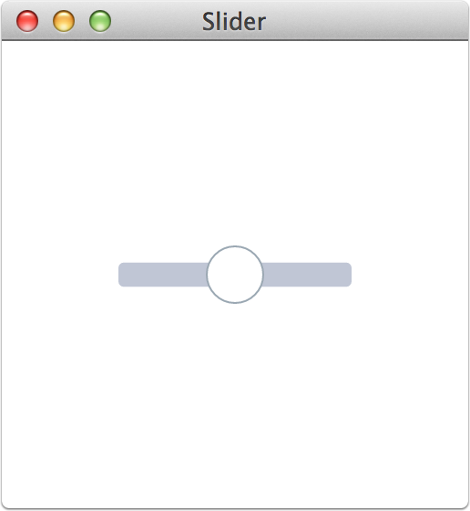
end widgetWhen you test the widget, it should look like the image below.
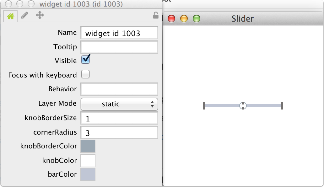
Adding properties to the widget
Now that the variables are in place, let’s allow a developer to modify them in LiveCode or by using the property inspector. Start by defining the properties. Below are definitions for cornerRadius, barColor, knobColor, knobBorderColor, and knobBorderSize. Notice that for some properties, the variable will be accessed directly when getting it. For the colors a handler is required that will convert the Color variable to a string (e.g. 255,255,255). Each variable will be set using a handler so that we can tell the widget to redraw itself when a property is changed.
Put the following code below the variable declarations.
property cornerRadius      get mCornerRadius        set setCornerRadius
property barColor          get getBarColor          set setBarColor
property knobColor         get getKnobColor         set setKnobColor
property knobBorderColor   get getKnobBorderColor   set setKnobBorderColor
property knobBorderSize    get mKnobBorderSize      set setKnobBorderSize
Specifying the Property Inspector UI to use for a property
Next let’s tell the property inspector in LiveCode which UI to use for setting the color properties. Add this code below the property declarations:
metadata barColor.editor        is "com.livecode.pi.color"
metadata knobColor.editor       is "com.livecode.pi.color"
metadata knobBorderColor.editor is "com.livecode.pi.color"
After adding the getters, setters, and helper handlers for converting colors to and from a string, here is what your code should look like:
widget community.livecode.trevordevore.slider
	use com.livecode.widget
	use com.livecode.canvas

	metadata title is "Slider"
	metadata author is "Trevor DeVore"
	metadata version is "1.0.0"

	-- properties
	variable mCornerRadius    as Number
	variable mBarColor        as Color
	variable mKnobColor       as Color
	variable mKnobBorderColor as Color
	variable mKnobBorderSize  as Number

	property cornerRadius      get mCornerRadius        set setCornerRadius
	property barColor          get getBarColor          set setBarColor
	property knobColor         get getKnobColor         set setKnobColor
	property knobBorderColor   get getKnobBorderColor   set setKnobBorderColor
	property knobBorderSize    get mKnobBorderSize      set setKnobBorderSize
	metadata barColor.editor        is "com.livecode.pi.color"
	metadata knobColor.editor       is "com.livecode.pi.color"
	metadata knobBorderColor.editor is "com.livecode.pi.color"

	public handler OnCreate()
		put 3 into mCornerRadius
		put color [192/255, 198/255, 213/255] into mBarColor
		put color [1, 1, 1] into mKnobColor
		put color [155/255, 168/255, 179/255] into mKnobBorderColor
		put 1 into mKnobBorderSize
	end handler

	public handler OnPaint()

		-- Draw the bar
		variable tSliderHeight as Number
		variable tSliderBounds as Rectangle
		variable tCenter       as Point

		put point [my width/2, my height/2] into tCenter

		put my height * 0.416 into tSliderHeight
		put rectangle [0, the y of tCenter - tSliderHeight/2, my width, the y of tCenter + tSliderHeight/2] into tSliderBounds
		set the paint of this canvas to solid paint with mBarColor
		fill rounded rectangle path of tSliderBounds with radius 3 on this canvas

		-- Draw the knob
		set the paint of this canvas to solid paint with mKnobColor
		fill circle path centered at point [the x of tCenter, the y of tCenter] with radius my height/2-mKnobBorderSize/2 on this canvas

		set the paint of this canvas to solid paint with mKnobBorderColor
		set the stroke width of this canvas to mKnobBorderSize
		stroke circle path centered at point [the x of tCenter, the y of tCenter] with radius my height/2-mKnobBorderSize/2 on this canvas
	end handler


	private handler setCornerRadius(in pRadius as Number)
		put pRadius into mCornerRadius
		redraw all
	end handler


	private handler getBarColor() as String
		return colorToString(mBarColor, false)
	end handler

	private handler setBarColor(in pColor as String)
		put stringToColor(pColor) into mBarColor
		redraw all
	end handler


	private handler getKnobColor() as String
		return colorToString(mKnobColor, false)
	end handler

	private handler setKnobColor(in pColor as String)
		put stringToColor(pColor) into mKnobColor
		redraw all
	end handler


	private handler getKnobBorderColor() as String
		return colorToString(mKnobBorderColor, false)
	end handler

	private handler setKnobBorderColor(in pColor as String)
		put stringToColor(pColor) into mKnobBorderColor
		redraw all
	end handler


	private handler setKnobBorderSize(in pSize as Number)
		put pSize into mKnobBorderSize
		redraw all
	end handler


	private handler colorToString(in pColor as Color, in pIncludeAlpha as Boolean) as String
		variable tColor as String

		if pColor is undefined then
			return ""
		end if

		put FormatInt(the rounded of ((the red of pColor) * 255)) into tColor
		put "," & FormatInt(the rounded of ((the green of pColor) * 255)) after tColor
		put "," & FormatInt(the rounded of ((the blue of pColor) * 255)) after tColor

		if pIncludeAlpha then
			put "," & FormatInt(the rounded of ((the alpha of pColor) * 255)) after tColor
		end if

		return tColor
	end handler
	private handler stringToColor(in pString as String) as Color
		if the number of chars in pString is 0 then
			return ""
			end if
		variable tRed as Real
		variable tGreen as Real
		variable tBlue as Real
		variable tAlpha as Real
		variable tComponentList as List
		split pString by "," into tComponentList
		variable tComponentCount
		put the number of elements in tComponentList into tComponentCount
		if tComponentCount is not 3 and tComponentCount is not 4 then
			// Invalid number of components detected
			throw "Invalid color"
		end if
		put (element 1 of tComponentList) parsed as number into tRed
		put (element 2 of tComponentList) parsed as number into tGreen
		put (element 3 of tComponentList) parsed as number into tBlue
		if tComponentCount is 4 then
			put (element 4 of tComponentList) parsed as number into tAlpha
		else
			put 1.0 into tAlpha
		end if
		return color [ tRed/255, tGreen/255, tBlue/255, tAlpha ]
	end handler
	handler FormatInt(in pNumber as Number) as String
		variable tNumberString as String
		put pNumber formatted as string into tNumberString
		if "." is in tNumberString then
			variable tDotOffset
			put the first offset of "." in tNumberString into tDotOffset
			delete char tDotOffset to (the number of chars in tNumberString) of tNumberString
		end if
		return tNumberString
	end handler

end widget
And this is what the property inspector should look like:
Storing property values for each widget instance
Now that the developer can set properties, we want to make sure that the properties are saved and loaded for each instance of the widget. You use the OnSave() and OnLoad() handlers for that. Here is what they look like for this widget. Notice that at this time you need to convert colors to a string when storing them.
public handler OnSave(out rProperties as Array)
	put the empty array into rProperties

	put mCornerRadius into rProperties["cornerRadius"]
	put colorToString(mBarColor, true) into rProperties["barColor"]
	put colorToString(mKnobColor, true) into rProperties["knobColor"]
	put colorToString(mKnobBorderColor, true) into rProperties["knobBorderColor"]
	put mKnobBorderSize into rProperties["knobBorderSize"]
	return rProperties
end handler

public handler OnLoad(in pProperties as Array)
	put pProperties["cornerRadius"] into mCornerRadius
	put stringToColor(pProperties["barColor"]) into mBarColor
	put stringToColor(pProperties["knobColor"]) into mKnobColor
	put stringToColor(pProperties["knobBorderColor"]) into mKnobBorderColor
	put pProperties["knobBorderSize"] into mKnobBorderSize
end handler
Conclusion
You should now have a basic widget that draws to the screen, allows you to set and get properties, and saves those widget properties in the stack the widget is attached to.
For the complete widget that allows you to drag the knob and sends a message while dragging, take a look at the slider widget in my livecode-extensions github repository.
